Retail Store Sales Yearly Analysis
Currently, I’m on a mission to hone and certify my Microsoft Excel skills. I obtained sales information for retail stores through Kaggle.
The data covered between 2015 and 2016.
1) Data Cleaning: There were three tabs of raw data, including order details, products, and property information. I was able to clean the data and eliminate extra spaces in the data by first using Ctrl + A to select all cells, unchecking Text Wrap, and then using the clean function and trim function.
2) Data Assembling & Analysis: To begin, I made a new tab to combine the data from the three tabs that were already there. I was able to create a table by connecting the data to my analysis tab using the Xlookup function. The data lacked the region from which its sales were coming, which I was able to obtain with the use of Google Bard and which was useful in analysing this data.
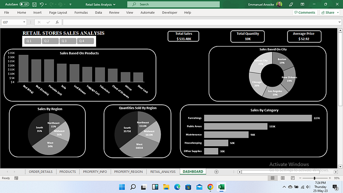
3) Data Visualisation: After completing the data analysis, I created a new tab for the data visualisation, which includes the following charts;
i) Column Chart: Based on the top 10 selling products, this chart displays gross sales.
ii) Doughnut Chart: Based on the percentage of sales performance, this chart displays the top 5 cities.
iii) Pie Chart — This displays the performance of the regions according to the largest percentage of sales.
iv) Pie chart — This displays the total number of quantities ordered according to regions.
v) Bar chart: This displays the product categories according to the volume of sales.

Notes: The charts were ordered from highest to lowest. The values are bolded to make them easier to read.
The currency being used is US dollars.
The dashboard is interactive, and using the slicer, you can view the trends by interacting with the yearly quarters.
